
Typography is more than a design ornament; it’s a potent tool that is the backbone of any website design. It structures and breathes life into the content by subtly communicating messages and stirring emotions.
Selecting the right typography is a real deal-breaker in web design. It’s the key that unlocks user engagement and understanding. In this blog post, we will delve into typography’s vital role in web design. Buckle up and join us on this exciting exploration. We’ll delve into its impact on readability and user experience and arm you with practical tips to ace your typography choices.
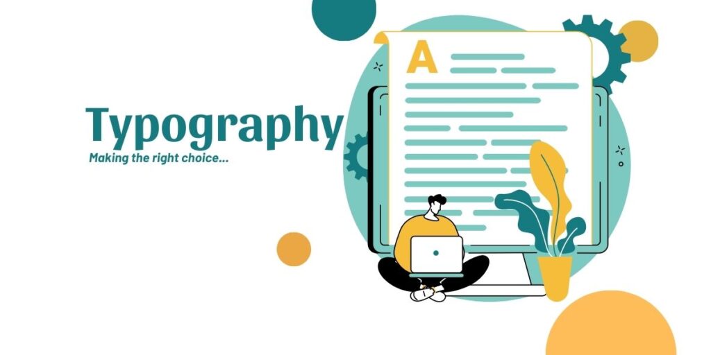
The Importance of Typography in Web Design
In web design, typography serves as a functional and aesthetic tool. It shapes the user’s first impression, guiding them through the digital landscape you’ve created and in the process, subtly imparting your brand’s voice and personality.
Visual Appeal
Typography significantly contributes to the visual appeal of a website. It can attract or repel users within seconds of their arrival. A well-chosen typeface can create an attractive and harmonious layout, enhancing the overall aesthetic appeal of your website. Conversely, poorly selected typography can make a website appear unprofessional, causing users to doubt its credibility.
Mood and Tone
Typography can also establish the mood or tone of a website. For instance, a formal, serif font website may evoke a sense of tradition and reliability. In contrast, a casual, sans-serif font website might be perceived as modern and innovative. Understanding the psychological effects of different typefaces can help you align your website’s typography with your brand’s personality and the emotions you want to evoke in your users.
Branding and Perception
Regarding branding, typography is vital in making your website stand out. It helps to establish a distinctive visual identity, aiding in brand recall. Good typography communicates what you say and how you say it, thus shaping perception. It brings out your brand’s personality, influencing how users feel about your website and, ultimately, about your brand.
Basics of Typography
To make the right typography choices, it’s essential first to understand the basics. It includes various components and types that each serve a different purpose.
Components of Typography
Typography components include font style, size, color, line height, and more. Font style refers to the specific typeface you choose, while size determines the readability of your text. Color is another crucial aspect, as it impacts aesthetics and overall readability. Other factors, such as line height, letter spacing, and text alignment, can significantly affect how your text is perceived and read.
Types of Typography
There are mainly four types of typography – serif, sans serif, script, and decorative. With their traditional feel, Serif fonts are often used in print and considered more readable. On the other hand, Sans serif fonts are modern and clean, often used in digital platforms. Script typefaces are typically used for more artistic or formal contexts, while decorative fonts, as the name implies, are used for decorative purposes, often in headers or logos.
Purpose of Each Type
Each type of typography serves a different purpose. For example, serif fonts are generally recommended for large bodies of text due to their enhanced readability. Sans serif fonts are ideal for web use, especially for small text sizes. Script and decorative fonts should be used sparingly, mainly for headers or highlight text, as they can be hard to read in large quantities.
Making the Right Typography Choices
Choosing the right typography involves considering various factors and ensuring that the selected type enhances aesthetics and functionality.
Factors to Consider
The audience, industry, brand identity, and content are all crucial factors when choosing typography. Understanding your audience and their expectations can guide your font choices. Similarly, each industry has its trends and norms, which should be considered. Your brand identity should be reflected in your typography, and finally, the content itself can dictate the most appropriate typography choice.
Typography Hierarchy
A well-defined typography hierarchy helps guide the reader’s attention and makes the content more digestible. Headlines, subheadlines, and body text should have distinct and consistent styles that allow users to navigate your content easily.
Contrast and Space
Contrast and space in typography are vital in improving readability and aesthetics. Good contrast between the text and background ensures your text is easy to read, while adequate spacing between lines and letters prevents the text from appearing too crowded.
Pairing Fonts
Choosing multiple fonts for a website is a common practice. However, pairing fonts can be tricky. The fonts should complement each other and create a cohesive look while also providing enough contrast to distinguish different elements.
Case Studies
To learn more about good and bad typography choices, it can be beneficial to examine real-life examples. Case studies provide valuable insights into the impact of typography choices on the overall design and user experience.
Impact of Typography on Readability
Typography greatly influences how easily website content can be read and understood. If readers need help processing the information due to poor typography, they will likely abandon the site.
How Typography Affects Readability
Fonts that are too small, too ornate, or not contrasted enough with the background can make texts hard to read. Similarly, proper line height and character spacing can make a simple read work. Therefore, typography significantly affects the ease users can absorb your content.
Enhancing Readability through Typography
Choosing the right font size is crucial; it should be large enough to read comfortably on all devices. Using a high-contrast color scheme can also make your text stand out and be more readable. Moreover, setting appropriate line height and letter spacing can make a big difference in text readability, making your content easier to scan and process.
Examples
Including examples highlights the effects of various typography choices on readability. Comparing a website with good typography versus one with poor typography can illustrate how these principles affect the user’s reading experience.
Impact of Typography on User Experience (UX)
Typography plays a significant role in user experience design. It’s not just about making the website look good but also about making the content easy to navigate and understand.
Relationship Between Typography and UX
Typography helps guide the user through the content, creating a visual hierarchy that makes navigating the site more accessible. It can highlight the most essential information and make the content more digestible, leading to a better user experience.
How Typography Can Enhance or Impair User Journey
Good typography leads the user naturally through the content, making their journey smooth and enjoyable. It makes the content easy to read and understand, reducing cognitive load and enhancing the overall user experience. On the other hand, poor typography choices can confuse and frustrate users, causing them to leave the site.
Examples Illustrating the Impact of Typography on UX
Including examples can help readers understand the real-world implications of typography on user experience. Showcasing a site with good typography and comparing it to one with poor typography can help readers visualize the impact of these choices on the user journey.
Resources and Tools for Choosing Typography
Making the right typography choices can seem daunting, but numerous resources and tools can assist in simplifying decision-making and enhancing design outcomes.
Online Tools for Choosing Typography
There are several online tools available that can help you visualize different typefaces and combinations. Tools like Google Fonts, Font Pair, and Adobe Fonts can provide a vast library of fonts. Tools like Fontjoy can suggest font pairings based on your choice.
Effective Use of Tools
While these tools are powerful, knowing how to use them effectively is key. When using font libraries, filter options based on your specific needs, such as legibility, mood, or style. Remember to check the combinations in various contexts in pairing tools to ensure they work well across your design.
Introduction to Popular Typefaces and Their Uses
Understanding popular typefaces and their typical applications can also be helpful. For instance, Helvetica is widely used for its clean, modern appearance and excellent readability, making it suitable for various applications. On the other hand, Times New Roman is a classic serif font often used in more formal or traditional contexts.
Conclusion
In the end, good typography isn’t about making your website look good—it’s about creating an optimal, seamless, and engaging user experience. So, the next time you embark on a web design project, remember to take a thoughtful approach to typography—it can make or break your website’s success.